Showing posts with label Color Icon. Show all posts

Sunday, September 23, 2012

Wet n Wild Color Icon Giveaway!!!

Orange Lipstick Blog has officially hit 5,000 pageviews!  Yay!  Thank you all SO MUCH for your continued support.  It means the world to me!

As a thank you, I'm giving away three Wet n Wild Color Icon palettes.  You can enter to win using the Rafflecopter widget below.


PLEASE NOTE: This giveaway is only open to US residents. (Sorry, international readers!) The winner will be notified within 48 hours of the competition's closing. The winner will have 72 hours to respond before a new winner is selected. 


a Rafflecopter giveaway


Reviews of the prizes:
Comfort Zone
I Got Good Jeans
Walking on Eggshells


(These are pictures of mine but I promise you're getting unused, new ones!)


XOXO

-Kaitlin

Email me at orangelipstickblog@gmail.com
Tweet me at OrangeLipstickK
Find me on Facebook at Orange Lipstick Blog

All items were purchased by Orange Lipstick for giveaway purposes.

Thursday, September 20, 2012

Wet n Wild Color Icon mini-series Part 5: Comfort Zone

Imagine if you will that in some terrible twist of fate you suddenly use up all your eyeshadows and must replace your stash.  Someone hands you $5 and tells you to go into the drugstore and buy ONE thing. 


What do you get?!  Well, if you're me, you grab Comfort Zone!


This palette has been heralded all across the Internet in tons of beauty blog.  The lovely neutrals and pop of green make this a super nice palette for only $5.


Like the Petal Pusher palette, there are two sets of the standard browbone, eyelid, and crease shades plus the definer.


I'm going to just let the pictures do the talking but look how beautiful these are!  The copper penny color is especially gorgeous.


This definer shadow is so unique - it's a reddish brown with green duochrome.  Just amazing!
You need this palette!  Don't you love just how pigmented these are?  Ugh, I can't even emphasize how much I love it.

You need it!

Part 4:  Petal Pusher
Part 1:  I Got Good Jeans

XOXO

-Kaitlin

Email me at orangelipstickblog@gmail.com
Tweet me at OrangeLipstickK
Find me on Facebook at Orange Lipstick Blog

All items were purchased by Orange Lipstick for personal use and review purposes.


Wednesday, September 19, 2012

Wet n Wild Color Icon Mini-series Part 4: Petal Pusher

Today I'm bringing you Part 4 of my Wet n Wild Color Icon shadow mini-series and this is the first eight pan palette I'm going to show you! 


This grouping of purple and garnet hues is Petal Pusher.  It features the standard browbone, crease, and eyelid setup but with the added benefit of a defining shade.


Now, purples are notoriously finicky and these are no different.  They are rather soft but they have only decent color payout.  Plus, they can look a wee bit powdery on the eyes.


You can see that I adore the eyelid shade on this side!


I like to mix the eyelid shade on the left with the browbone shade on the right for a custom color.  (I used it in THIS look.)


All swatches were done dry on bare skin, no primer.

Left side

Right side
As you can see, the shades are rather patchy.  I like this palette, but I don't love it.  The dark shades on the right side go completely unused by me.

These eight pan palettes are $4.99 but unfortunately I'm not sure this one is worth it.  You can grab these at almost any drugstore.

Part 5 is headed your way tomorrow, dears!

Part 1:  I Got Good Jeans

XOXO

-Kaitlin

Email me at orangelipstickblog@gmail.com
Tweet me at OrangeLipstickK
Find me on Facebook at Orange Lipstick Blog

All items were purchased by Orange Lipstick for personal use and review purposes.

Tuesday, September 18, 2012

Color Icon mini-series part 3: I'm Getting Sunburned

Today's Wet n Wild Color Icon trio is the terribly named I'm Getting Sunburned.  I hate this name!  Wear sunscreen, y'all!


This trio contains a pink, brown, and gold.  Pinks and browns seem to be popular in these Color Icon trios (see Part 2).

This is probably my least favorite trio out of the ones that I have because I feel like the texture of all three shades is a bit dry for the range.  The pink is especially hard.


The pink is a shimmery cotton candy kind of color.


 However, the brown is very dense and beautifully pigmented.


The gold is quite standard but I do love a good gold!


My favorite color from this trio is the beautiful brown!  The above swatch is just one swipe of brown.  The other two are more heavily swatched.

These aren't terribly creative colors - they're pretty easily duped.  However, this is still quite a nice steal at $2.99.  You can find these shadows at almost any drugstore.

Check out the other Color Icon palettes I've swatched:  


XOXO

-Kaitlin

Email me at orangelipstickblog@gmail.com
Tweet me at OrangeLipstickK
Find me on Facebook at Orange Lipstick Blog

All items were purchased by Orange Lipstick for personal use and review purposes.

Monday, September 17, 2012

I'm not "Walking on Eggshells" when I tell you these trios are "Sweet as Candy!"

Continuing in my mini-series about Wet n Wild Color Icon shadows, today I'm showing you two incredibly similar palettes.  Don't be fooled, though!  These are quite different!


On the left there's Sweet as Candy and on the right is Walking on Eggshells.  These both make me think of Neapolitan ice cream!  Yum!  (What flavor do you always want?  Does anybody seriously take equal portions of all three?!  No way!)


Ok, so both palettes feature a white/off-white browbone shade, brown crease shade, and pink eyelid shade.


Sweet as Candy

Walking on Eggshells


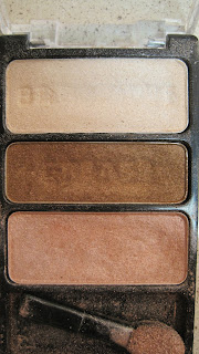
Sweet as Candy's browbone shade is more true white.  I'd say it's the least pigmented out of all six of these shades.  It has a slight shimmer to it - as do all of today's shades.  Walking on Eggshell's white is more creamy white.   The pigmentation is much better.


Sweet as Candy's crease shade is a grayish brown color.  I'd say this is the color I instantly think of when I think "brown."  Walking on Eggshell's crease shade is more yellowish brown.  It reads as milk chocolate to me!


Sweet as Candy's eyelid shade is much more pink than Walking on Eggshell's eyelid shade.  It has a nice rose color whereas the Walking on Eggshell pink is more champagne colored and metallic.


L - Sweet as Candy; R - Walking on Eggshells


So which trio wins out?  Well, they're both steals at $2.99!  However, I prefer Walking on Eggshells.  I think the pink in Walking on Eggshells is much more wearable than the pink in Sweet as Candy.  


Sweet as Candy

Plus, Sweet as Candy loses points for the poorly pigmented browbone shade.  I think Walking on Eggshells creates a gorgeous neutral eye and this is something I grab if I'm feeling rushed and can't come up with an eye look quickly.


Walking on Eggshells

You need it!


XOXO

-Kaitlin

Email me at orangelipstickblog@gmail.com
Tweet me at OrangeLipstickK
Find me on Facebook at Orange Lipstick Blog

All items were purchased by Orange Lipstick for personal use and review purposes.
Sunday, September 16, 2012

You'll love these "Jeans" from Wet n Wild!

Today I'm kicking off a little mini-series of posts about the Color Icon shadows by Wet n Wild.  I adore these more than just about any other drugstore product.


These are only $2.99 and are incredibly high quality.  They also come in 8-pan palettes, too.  


Today I'm showing you the I Got Good Jeans trio.  (I cringe at the poor grammar every time!)


All the trios feature a browbone, crease, and eyelid shade.  I think this is especially useful for makeup newbies.  Unfortunately, I still haven't figured out how to make these three shades work for me in the way they're described.


The browbone shade is a silvery, light blue.  I don't have any other shades like this in my stash but a more experienced junkie might have some dupes.  (I feel special that my palette has "browbone" printed upside down!)


The crease shade is a navy blue with electric blue pearl in it.  It's pretty but I'd say it's the weakest shade in the bunch.  (That's not a terrible critique because I think all three shades are great!)


The eyelid shade is a lovely metallic gold.  It's dupeable but I think this is a really nice shade!


This trio is incredibly high quality - the shades are dense and buttery.  The navy shade fades slightly throughout the day but it's still nice.  

Like I said, I'm not quite sure how to combine these eye colors without looking like a clown!  I'm still working on it and will let you know what I come up with!


You can find these Color Icon shadows at most drugstores for $2.99.  Such a steal!  I'll show you my other Color Icon shades in the coming weeks.


XOXO

-Kaitlin

Email me at orangelipstickblog@gmail.com
Tweet me at OrangeLipstickK
Find me on Facebook at Orange Lipstick Blog

All items were purchased by Orange Lipstick for personal use and review purposes.